Here are some additional Lightning Developer Tips I’ve picked up along the way.
See my Lightning Component Dev Tips, Lightning Component Dev Tips 2, and Lightning Component Dev Tips 3 for my other tips.
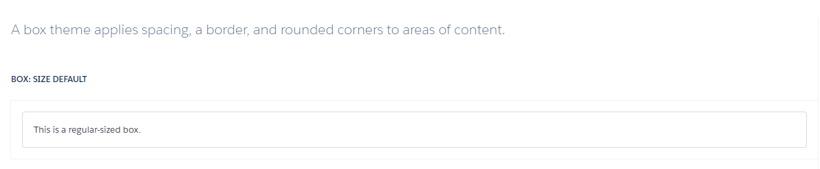
USE SLDS-Box CSS For Default Styling
As much as possible, use the Lightning design system for styling so that you’re leveraging the native Lightning styling as much as possible and when Salesforce makes changes, you’ll automatically inherit their styling. When creating a new container component, wrap it in a div with the slds-box CSS class so it’s automatically styled. SLDS-Box Documentation.
Box Example Screenshot
Leverage New Lightning Base Components
Salesforce releases every 4 months and with Lightning being a major focus, they’re releasing more and more Lightning base components for developers to use. See the Lightning Base Component List for an overview of them.
Some recent additions that I like are the lightning:inputField, lightning:outputField, lightning:flow, and lightning:helptext. The new inputField is good because it’ll dynamically render the appropriate field input based on the underlying data type and for picklists with restricted values based on a record type, it’ll automatically limit the values to those. Since Apex doesn’t natively allow one to get a picklist’s values for a given record type without various hacks and workarounds, this was a welcome addition.
Use Action Attribute(s) To Override Default Behavior
There are times when a component wants to override one of its child component’s behavior. One way is to have the child component have a default event handler that does default behavior and to have an Aura.Action attribute that lets its container component provide an alternate event handler if needed.
For example, let’s say we have a custom Data Table component where the Name column has a link that opens the record’s detail page by default. However, some components want to open their own custom record detail when one clicks the name instead. Create a custom attribute whose type is “Aura.Action” and then in the onclick handler, use the ternary operator to dynamically bind the override action if there is one. If not, use the default action. In the container component, provide a different action.
Child Data Table Component
Data Table Container Component
What other tips do you have?