The last few weeks were spent learning and being hands-on with Lightning Experience, which is Salesforce’s replacement UI for internal, non-community users. Here are my thoughts on it so far.
User Interface
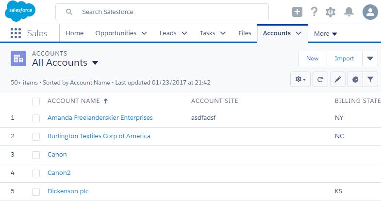
A screen shot of the “All Accounts” listview in Lightning Experience from a personal development org.
Overall, the user interface is better than Salesforce Classic but it feels like an incremental improvement instead of a revolutionary one.
Salesforce decided to keep feature parity with Salesforce Classic and make the look and feel modern using a Single Page Application (SPA) architecture using individual components built on the Aura framework and the Lightning Design System. The structure of the pages consist of
- Global Search – The global search is at the top so one can search for records and files.
- App Switcher. The App Switcher displays the currently selected application, which is the “Sales” application in the above screen shot. The application is the list of tabs that comprise that application which can be customized like in Salesforce Classic.
- Navigation Bar – The navigation bar is the collection of tabs in the application. All the Object Tabs are a menu that let you, depending on permissions, create a new record, view recently viewed records, and view recent viewed listviews.
- Main Body – This is where the main content is displayed. In the above example, the all accounts listview is displayed.
Having used Salesforce Classic for years, it was very easy to pickup the basic interactions since most of the day-to-day operations had a one-to-one comparison to Salesforce Classic features and concepts such as Objects, Listviews, Search, and navigation. It also works well on mobile browsers compared to Salesforce Classic.
Sluggish Performance
Everyone keeps touting that Lightning Experience is faster because it uses a SPA architecture with its client side framework, Aura, but it feels slower to me than Salesforce classic. When initially logging in, it takes around 3-4 seconds to open the vanilla dev org’s home page. Salesforce Classic opens the home page within a second. A quick search yields the Lightning Experience LEX – lightning speed please! Idea.
Many factors affect performance so try this out in your own sandbox and see what the performance is like. I’m comparing Lightning Experience performance in my own personal development org with a few thousand test account records to Salesforce Classic on the same org using a 2016 mid-grade laptop on a broadband connection.
Too Much Asynchronous Behavior
After the initial page loads, the processing image is often seen when opening menus on the tabs and other areas that you wouldn’t expect since you just waited a decent while for the application to open.
Administration Awkwardness
Record Page Layout Admin with VF
The main “Details” tab and the “Related” tabs are configured using page layouts from Salesforce Classic. When you can drag-n-drop various components onto the page and rearrange them with ease but then have to view the page layout in Salesforce classic to affect the details and related lists, it is awkward and feels unpolished.
From a technical perspective, it makes sense to use the same page layout configuration to drive both the Salesforce Classic and Lightning Experience record page layouts so they have a similar look and feel for when someone switches between the views and it reduces how much configuration is needed for the UIs. However, the administration experience is still awkward. I want a Lightning experience page editor that’s completely done within Lightning and doesn’t depend on Salesforce classic page layouts. Understandably, this would cause more work for an admin if they have to keep the layouts synchronized between Lightning Experience and Salesforce Classic but it also gives the ability, more easily, to allow different page configurations across the user interfaces.
Visualforce setup pages show in Lightning
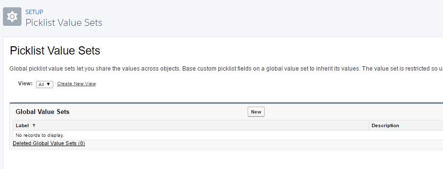
Instead of creating Lightning Experience specific administration pages, Salesforce decided to reuse many of its existing Salesforce Classic administration pages but within the Lightning Experience “container”. See the global picklist value sets image above for an example.
Object Definition Custom Field Paging
When viewing an Object’s definition in Object Manager, the list of fields are paged now to show 25 fields at a time. If you’re viewing an object with a lot of fields, say 100 or more, you have to scroll through the pages or use the object’s search to find the desired field(s). This is one area where I actually preferred seeing all the custom fields without having to page through them. These extra clicks mean extra time to examine an object and find the details desired. It would be nice to have an option to view all fields and be able to keep that preference enabled.
Lightning Component AppExchange
Salesforce has a new Lightning Component AppExchange marketplace where ISVs can sell Lightning components. This is great in theory but at the time of this writing, early Feb 2017, there are only about 90 components. Many of them seem useful but none feel compelling enough to be a must-have. Since the marketplace has been around for a while, I was expecting hundreds of components to be available instead of 90. This seems to be an indicator that Lightning still isn’t mainstream and has a ways to go yet.
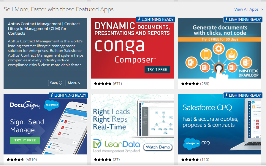
What’s nice is that ISVs can upgrade their existing AppExchange packages or develop new ones to be Lightning compatible. On the AppExchange, the products that are Lightning ready have the “LIGHTNING READY” designation in their listing as seen below.
Lightning Development
A separate post or two will be created in the future to detail this more.
So far, I’ve developed a generic Lightning “Lookup Dropdown” record component that lets one drop the component on a record detail page, tell it which lookup or master-detail field to use, and it’ll show a dropdown of all the records in the parent object. One simply chooses the parent record and clicks Update to update that field with the selected record.
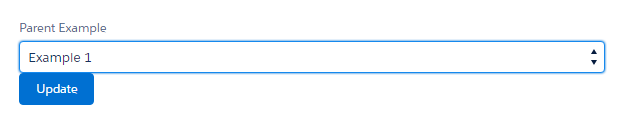
The use case for this is to replace the out-of-the-box Lookup textbox field that uses autocomplete after typing in a few characters to find the desired parent record. If the parent object only has a manageable amount of records, say 200 or less, show all of them so the user doesn’t have to know which one to select.
To develop this fairly simple component required more Javascript and Apex than expected. To implement the same functionality with a Visualforce component would’ve taken half the amount of code. What led to this is that the Lightning Component Framework doesn’t handle as much of the plumbing for you, at least yet, as compared to Visualforce. Also, the list of available Lightning components is still limited. I’m expecting Salesforce to release more infrastructure and components here to ease the burden on Lightning development in future releases.
Limited “Lightning” Community Support
Lightning Experience is not supported in communities at this time.
What is supported are a few “Lightning” compatible templates. These include the “Napili”, “Koa” and “Kokua” templates at the time of this writing in early Feb 2017. Future posts will detail my experience with these. For now, I recommend starting with the Napili template and evaluating if that’s a good fit for your community.
Closing Thoughts
Lightning Experience at first glance looks impressive but after using it for a while, it still feels like a Beta to me that needs a bit more polish and performance tuning. My recommendation is to use it for out-of-the-box implementations that require little to no customization and wait a few more releases for Salesforce to implement more Lightning features and infrastructure and then reassess.
What are your thoughts on Lightning Experience? Has your team and organization switched over yet?
I mentioned this to you already but we’ve decided to write all new UI using lightning. We’re liking it so far, but there has definitely been a learning curve for me after using Visualforce for so long.
As far as performance goes, it definitely loads a lot more slowly. That being said, we were able to build our application’s configuration all on one lightning component that loads several other lightning components as nested components. This means that while it may take a few seconds for the initial page to load, editing configuration and switching to other configuration tabs within the configuration UI is quick because it’s already been loaded.
> Instead of creating Lightning Experience specific administration pages, Salesforce decided to reuse many of its existing Salesforce Classic administration pages but within the Lightning Experience “container”. See the global picklist value sets image above for an example.
I noticed this too! I actually think that Salesforce is just behind schedule – I expect that we’ll eventually see all of these “classic” pages turn into the new lightning experience soon enough. It makes the whole experience feel unfinished.
– Bobby
Bobby,
I hope it’s just “Salesforce being behind schedule” for some pages still using Salesforce Classic. If it’s permanent, it won’t look professional and it’ll conjure questions from clients asking why why why things are different that we and other Salesforce professionals will have to respond to.
What’s are some unexpected things you learned while developing in Lightning?